What is COLOR THEORY and why is it important in GRAPHIC DESIGN?
What is color theory?
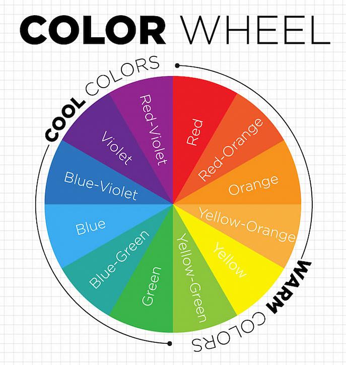
Color theory is a term used to describe the collection of rules and guidelines regarding the use of color in art and design, as developed since their early days. Color theory informs the design of color schemes, aiming at aesthetic appeal and the effective communication of a design message on both the visual level and the psychological level. Colors can be combined to form one of the five main color schemes that allow designers to achieve harmony in their designs.Color temperature is another vital consideration in design—by distinguishing between warm, cool, and neutral colors, we apparently have the power to evoke emotional responses in people. Warm colors are those with shades of yellow and red; cool colors have a blue, green, or purple tint; neutral colors include brown, gray, black, and white. While these groupings hold true in a general sense, emotional responses to colors can also be heavily affected by gender, experiences, cultural associations, and other personal factors.
Why is color important in design?
The importance of color design stems from the significance of color to the human mind. Color creates ideas, expresses messages, spark interest, and generate certain emotions. Selecting colors for a website necessitates choosing color combinations that are sober and harmonious to the eye. The simplest method in selecting color combinations is by mixing comparable colors to see if they work well together. Colors can be combined in website design from the same color palette or different ones, but the color palette should not be too bright, too dark, or distract from the content.In order to choose the right colors and color combinations, it is important that the graphic designer has a basic understanding of color theory. Color theory is the study of color in art and design, their relationships with each other, and principles used to create harmonious color schemes.


Comments
Post a Comment